Labels

Saturday 18 August 2012

Affinity with the element Carbon (part 2)


2012


Artist: Me
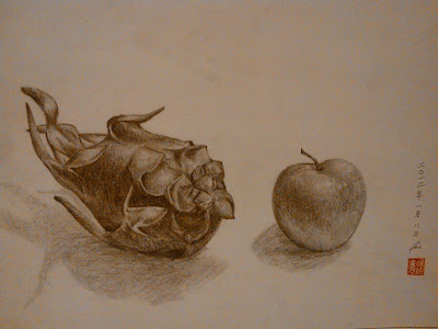
Title: Still life of dragonfruit and apple
Type: Pencil
Dimensions: 42 cm x 29.7 cm
Date: 1/8/2012

It was rather tedious when I did this pencil drawing. I spent 4 hours working on it, which exceeded my original aim to finish it in 2 hours. As the dragonfruit has a complex outer structure, I had to capture every shadow casted so that my final piece will look realistic. Also, I drew a rough outline of each fruit first, positioned them on my drawing paper and made sure they were spaced out before getting on to the details.

I started with the dragon fruit first, knowing that it would be the tougher one to draw between the two. I spent more than 3 hours completing it. However, I only spent 10 minutes drawing the apple, after which, my teacher touched up a bit. As I was sitting on a chair looking down at the fruits, the perspective of this drawing seems a little warped and the position of the shadows look strange as well.

I learnt that for still life using pencil, the most important thing is the shading, not the shadow. The shadow of the object can be sketchy since it is a pencil drawing. I love to draw using pencil since I can erase any mistakes and redraw, unlike watercolour or poster colour, which mistakes are intolerable as it would mean to redo the whole art work.


Artist: Me
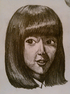
Title: Untitled
Type: Pencil
Dimensions: Unknown
Date February 2012

It is from one of my sketchbook pages when I was investigating on how to sketch a human. I always find pleasure in drawing realistic human images as I get to focus on the task and really examine the picture and try to replicate it using pencil. It's a relaxing process. No wonder art is sometimes used as a therapy for patients. It brings innner peace and tranquility.

Affinity with the element Carbon (part 1)

2009


Artist: Me
Title: Still life of nose sculpture
Type: Pencil
Dimensions: 42 cm x 29.7 cm
Date: 2009 (Secondary 1)

I did this during an AEP practical session. I was still improving my skills of drawing with pencil, thus I was not that effective. The form is skewed as I moved when I was drawing it. Also, the tones are not dark enough since I used a 2B pencil, and there is zero variation in the shading, causing the whole drawing to look dull and unfinished.

**********************************************************************************

2009


Artist: Me
Title: Still life of lip sculpture
Type: Carbon chalk
Dimensions:  50 cm x 32 cm
Date: 2009 (Secondary 1)


Artist: Me
Title: Still life of an armchair
Type: Carbon chalk
Dimensions: 50 cm x 32 cm
Date: 2009 (Secondary 1)

I fared pretty well for these two pieces of carbon chalk work, each an A1 grade. However, I thought they did not deserve the mark since they look pretty sketchy and unfinished and have low variations in light and dark tones. I sketched out the shapes of the objects before shading them. Their forms are quite regular since I used a view finder (hand made) to draw them.

Dreams & Reality


Exhibition

This exhibition showcased French Impressionist paintings done by famous artists such as Vincent van Gogh and Millet. It was held at the National Art Museum, Singapore.

**********************************************************************************
Painting 1


(I forgot to take a photo of the caption)

As suggested by the title of the exhibition, paintings depicted either one of the two themes. This painting depicts reality, where two female workers seem to be starting a fire. This is a common real-life scene, thus it perfectly portrays Reality.

The brushstrokes are not refined as the texture of the painting appears to be grainy. This reminds me of Pointilism which was to place dabs of paint next to each other to portray subject matter, The dabs of paint would merge together when viewed from afar. These type of paintings usually appear to be grainy as well.

The subject matter of this painting reminds me of yet another art movement called Realism. Everyday objects and people doing their daily activities were usually portrayed. These type of paintings are called genre paintings.

Hence, with all these elements that suggest that this painting may not actually belong to the Impressionist paintings, I wonder, why is this considered as one of them? Then I remembered one of the paintings that I have come across, namely, Impression: Sunrise.


Artist: Claude Monet
Title: Impression: Sunrise/ Soliel Levant
Type: Oil on canvas

Impression: Sunrise looks unfinished, sketchy and painterly. The brushstrokes are quick and gestural, which gave the wrong impression of someone trying to finish a preparatory work quickly. The painting does not have a particular subject matter, just a seascape with a rising sun, the boats and the water. There is no particular meaning to the work, just like this painting. Both just portray a scene in life, perhaps for documentary purpose.

*********************************************************************************

Painting 2


(I forgot to take a photo of the caption)

This painting depicts the French Revolution, with Liberty leading the French in the revolution. However, what’s interesting is there is a silhoutte of a black horse behind Liberty. The purpose of the French Revolution was to change the society for a better one, the dream of every French during that time. Hence, this painting represents Dreams. The colours used in the background of this painting are complementary as seen in the pink clouds and blue sky.

Back to the silhoutte of the horse, I remembered a painting of Napoleon, called Napoleon crossing the Alps. The horse silhoutte with Liberty in front resembles the subject matter of Napoleon crossing the Alps, that is, Napoleon on his horse leading his troop to cross the Alps. That painting was to show how majestic Napoleon was and portray him as the hero of the French. Hence, I think the artist of this painting wanted to show Liberty as the heroine in the Revolution.


Artist: Jaques Louis David
Title: Napoleon crossing the Alps
Type: Oil on canvas

However, what’s ironic is that the comrades are lying on the ground under Liberty who is leaping across them, seems to me that those comrades are disregarded and appear to be at her disposal. In a Revolution, when the lives of all people are involved, when all people are involved in the fight for greater good, everyone should be regarded with respect and dignity, not trampled on like this. What’s worse is that there are crows or ravens hovering on top of the dead comrades! That means the corpses are left rotting on the battleground, unclaimed! This shows how cruel revolutions are, how much blood was lost and how much sacrifices made to gain Liberty.


Artist: Eugene Delacroix
Title: Liberty leading the people
Type: Oil on canvas

(Liberty leading the doomed)

The Days back then


Artist: Me
Title: The Days back then
Type: Photography
Dimensions: Unknown

This photo that I took has a balanced composition— the boys in the forground and the water in the background. The material used to make the sculptures, bronze, further balances the composition as bronze has a greater density than water, so it ‘sinks’ in water.

I took a photo of the sculpture, The First Generation, at this angle because I want viewers to feel what it is like to be among the company of boys who are about to leap into the Singapore river. We can no longer do this now since it is illegal. I suppose swimming and playing in the Singapore River must be a favourite past time of the children of the First Genenration. But I can never experience it and the people who have done it can only relish the experience. This photo serves to remind the younger generation as well as trigger memories of the older generation.

A walk in the CBD

 
Artist: Unknown
Title: Unknown
Type: Bronze sculpture
Dimensions: Unknown

This is a bronze sculpture of a mother and a child. I think the scale is too small and the location is not suitable. It is situated among the bushes and behind a pond, which caused it to be unnoticeable and insignificant. It is indeed a pity. People can just walk past and not see this sculpture at all.

A successful sculpture should have a catchy theme, attractive composition and subject matter and of course, a good site to showcase the sculpture. Although this sculpture has a catchy theme- mother and child, attractive subject matter- contorted body of the mother, attractive composition- mother writhing in agony and naked baby helpless and vulnerable, the sculpture should be placed in a better location. For example in front of the entrance of a building or perhaps in the middle of a pond to enhance the effect and add on to the helplessness portrayed by the baby.

**********************************************************************************


Artist: Henry Moore
Title: Reclining figure
Type: Bronze Sculpture
Dimensions: Unknown

This is an artwork by Henry Moore, a sculpture of a large reclining figure, weighing four tonnes and one of the largest works ever made by Henry.
The reclining figure is a female, stylised and possesses a flowy form. It is placed in a shallow man-made pond and the places where the sculpture touches the water, there will be patches of pebbles. There is also a tiled walk way across the pond, in front of the sculpture, for viewers to get a closer look at the bronze figure.


Tiled Walkway

This is a successful sculpture since the size is really big and the form is interesting. The water is also an enhancement since it reflects the sculpture’s image, giving the whole sculpture a totally different effect, making it look ethereal. There is also a slope for viewers to walk up towards the sculpture. Both the tiled walkway and the slope enable viewers to feel as though they are included or even part of the art work, giving a whole new experience to viewers. Thus, viewers may have a good impression on the artwork and thus, they may even like it.


Slope

*********************************************************************************


Artist: Unknown
Title: Unknown
Type: Bronze sculpture
Dimensions: Unknown

In front of One Raffles Place

This is another bronze sculpture outside One Raffles Place. It looks like a karst formation of limestone, just that this is not made of limestone but bronze. I like the location of the sculpture. It is right in front of the building, which serves to lead viewers eyes to look at the building as they look at the sculpture. This is a good tactic, like what some would say— kill two birds with one stone. As viewers admire the sculpture, they admire the building as well. Thumbs up!

Adding on to the idea that it looks like a karst formation, I think the karst formation has got something to do with One Raffles Place. One Raffles Place belongs to UOB now, an established bank. The process of karst formation involves what is referred to as “the carbon dioxide cascade.” Thus, soluble bedrocks are being moulded by natural elements (rain with dissolved carbon dioxide), karst formation is formed. This could mean that even though there were countless setbacks, UOB emerged through the tough times to become what it is today, just like the karst formation, beautiful even though it has encountered acid rain. Thus, the sculpture could be a symbol of UOB, tried and proved to be a champion.

*********************************************************************************


Artist: Yang Ying-Feng
Title: Progress & Advancement
Type: Bronze sculpture
Dimensions: Unknown

Front view (skyline)

This is a bronze sculpture near Raffles Place MRT station, with many commercial buildings surrounding it. It is a spiral-like sculpture with intrinsic details on it.

Firstly, we can see the developed, prosperous and famous skyline of Singapore, showing our economic prowess and status. However, as I went around the sculpture, I saw scenes of the fishing village Singapore once was. There is a Malay kampong and on the river, there are different types of ships, Chinese junk, British ship etc. This shows the pretext of Singapore before it was developed. I also noticed that there are a few Chinese junks, malay fishing boats and other  trading boats moored by the riverside, with traders streaming into the kampong. I guess this is perhaps the earliest form of racial integration in Singapore?


Fishing boats


Malay kampong


Deck of Chinese junk

As I moved on, I saw some buildings of old Singapore, a scene that depicts Singapore in its 1900s, with bullock carts and British architecture etc. A bustling city then already. Then, as I continued, I came back to the present, the established city again. This sculpture is like a time machine that transports viewers back to the past and to the present again, perhaps to remind viewers, especially Singaporeans, of the effort made by our forefathers and to urge us to work on the progress made and advance. Onward Singapore!


Old Singapore

*********************************************************************************

 
Artist: Chong Fah Cheong
Title: The First Generation
Type: Bronze
Dimensions: Unknown

A bronze sculpture of a handful of naked boys ready to jump into the river. And this river is no common river, but the iconic Singapore River. I like this particularly because of the facial expressions of the boys. It was pure joy. This is a successful sculpture since it is site-specific and able to evoke strong emotions from viewers.

Friday 17 August 2012

Remembrance

Aerial View Side profile
Title: Remembrance
Artists: Hui Sze, Jing Lin, Xinge, Yi Yuan, Zhong Xin, Yu Qi
Dimension: diameter- 20 cm, height- 15 cm


A tomb once existed in the garden behind the school. It could have been destroyed by now. It was made from materials found in the garden. We intended it to be site-specific, just like how Andy creates art from nature.


We stumbled upon a tiny plant and some pebbles in the garden. And we have decided to surround the tiny plant with a ring of pebbles. It turned out to resemble a tomb and so we thought it would be interesting to see what we can continue do with 1) a ring of pebbles and 2) a tiny plant in the middle of the ring. We thought that tombs have a tombstone, so we found a white pebble as the tombstone and gathered some fallen wild flowers as offering. We picked up a snail’s shell along the way and placed it in front of the tombstone. Then, it occurred to me. A realisation.


The reason why we get to see plants growing healthily is due to the nutrients that exist in the soil, which are the result of the contribution of decayed matter. Organisms die and decay and go back to earth as nourishment for other plants that rely on it to grow well. It is the way nature functions, as a cycle.


We always forget why we can enjoy the beautiful scenary. We always forget the reason is because of the constant, endless and seemingly unnoticeable contribution of the organisms in the habitat that helped to sustain the scenary. We always forget that we should also do our part to make our environment beautiful.
Hence, I thought that the snail’s shell can represent the contribution of dead organisms and the tomb can serve as a commemoration and remembrance of the contributions made. This art work is a reminder to us, urging us to do our part to conserve the beautiful environment.

Extension


Artist: Andy Goldsworthy
Title: Pebbles around a hole
Dimensions: Unknown


“The underlying tension of a lot of my art is to try and look through the surface appearance of things. Inevitably, one way of getting beneath the surface is to introduce a hole, a window into what lies below.”-- Andy Goldsworthy


I think Remembrance is similar to Andy’s Pebbles around a hole sinceboth have a focal point, the tombstone and the black hole respectively. Also, both art works have pebbles as the main type of material.


“Movement, change, light, growth and decay are the lifeblood of nature, the energies that I I try to tap through my work…,” as quoted from Andy. Indeed, decay belongs to the lifeblood of nature, without it, nature cannot function, beauty is history.

Good as Goldsworthy

Broken-Pebbles.jpg
Artist: Andy Goldsworthy
Title: Pebbles, broken and scraped
Dimension: Unknown

“People do not realise that many of my works are done in urban places. I was brought up on the edge of Leeds, five miles from the city centre-on one side were fields and the other, the city.” — Andy Goldsworthy

This remarkable artist created this piece of work titled Pebbles Broken and Scraped. He is in the Environmental/ Land Movement. He extracts natural things from the nature to create his art work. His works embody the qualities— simplicity, profundity and inspirational. He loves nature, thus, he advocates protection and conservation for Mother Nature through his art work. His love for nature is the spirit of his works.

Yi Yuan and I selected this spiral structure made of pebbles, broken and scraped. We chose it because we felt that this piece of work was the most outstanding, in terms of contrast of colors, the grey and turquoise on the pebbles with the sandy hue of the beach and the texture of the pebbles due to scratches and the grainy surface of the beach. With the scratches on the pebbles, the art work looks as though it illuminates. These attributes serve to enhance the visual appeal of this art work. Since the pebbles were from the beach itself, both the spiral and sand complement each other very well, it is almost like as though the art work originally belongs to the beach, part of the landscape, which reminds me of Singapore’s East Coast Park and our aquatic ancestry. We used to be a fishing village and the sea and the beach used to be a common sight, part of the people’s life.

One look at the work, it is clear that the central focal point is the middle of the spiral, where the broken line starts and spirals outwards…

In the evening went to small
beach to work as the sun
went down - time the
completion of work with
sundown - broken stones
-cracked in two -not easy.
Scratched white around cracks
- made a sort of spiral which
suited this work - this is how
forms such as spirals/circles/balls
appear - out of the making and not
taken out there to be imposed
The above extract was taken out of Andy’s website, describing the process of making this piece of art.

I interpret the spiral as a journey. The spiral will only continue to spiral out in a similar fashion which can be liken to a long journey. Just like Singapore’s journey to independence. The scraped pebbles remind me of the people who had to eke out a living and scrape by life. Also, as it spirals out, it represents Singapore has to move on from its past and work towards a better future. Hence, with the sand as the background and the spiral motif, this artwork best fits in Singapore in terms of our history.

Also, as seen from a quote from a website on Andy,”For me looking, touching, material, place and form are all inseparable from the resulting work. It is difficult to say where one stops and another begins.” To me, the process of planning, thinking and searching for resources for his art work is likened to a spiral, whereby the start of the spiral is formed when Andy first had an inspiration. Then, as the planning goes on, the spiral continues to swirl outwards. The spiraling is never-ending even after Andy finishes his art work because like what he has said, “…looking, touching, material, place and form are all inseparable from the resulting work.” This is perhaps his definition of art making, as a journey, as a spiral. And the journey never ends, just like his passion for nature.

Just like Andy, Walter Demaria created the Lightning Field by placing steel rods in an open grass field. He waited until a thunderstorm approached and lightning struck the steel rods to take photographs of the moment when the lightning struck the steel rods. It created a visual spectacular when the lighting struck the steel rods. It was really as though the field was struck by lightning! The rods are used as the channel of communication or interaction between elements of nature. It is interesting as lightning can never strike a grassfield, but with Walter’s steel rods, it really did seem that the lightning phenomenally struck the field! While Andy explores nature by creating artwork from nature and his artworks decay, thus temporary, Walter explores nature by bringing elements of nature that do not interact naturally together. In other words, he defies nature by connecting lightning and grass together, two elements that cannot connect, by introducing a channel. He then documented the ‘phenomenon’ using photography.

Bringing back to Andy, photography is important in his work as his works are biodegradable. Because of this, it is of utmost importance to document his works, to prove that his works existed, before they decay and return to nature. Photographs last for a long time, thus, Andy uses photography in his work. Also, if he should document his works by painting pictures, then they would seem unrealistic as his works tend to be abstract-looking and do not ‘fit’ in with nature. Thus, photography gives a touch of realness in his works; the photos of artworks taken are more for the sake of recording evidence rather than for the purpose of art.
 

Untitled

Artists: Hui Sze and Yi Yuan
Title: Untitled

We have chosen to wrap plastic around a swing because we thought it would be interesting. The swing is always wet after a rain, which is really frustrating, so the wrapping of the swing shows how much we would like to protect the swing from natural elements so that we can always enjoy it.


After wrapping up the swing, it looks as though it is a gift, as if it is new, so I thought it would be good if we leave the plastic wrap on, since the swing is always misused and thus, it gets damaged quite often. Thus the plastic will serve as a reminder to those who play on the swing— take care of it (or else we will wrap up the whole swing).


Monday 13 August 2012

Nature in City


This is a photo taken when we went to the central business district. It shows a bronze sculpture in front of  One Raffles Place. The glass facade of the building reflects the image of the building across the road. The glass facade which acts as a mirror symbolizes psychological space and the realm of fantasy. Also, the glass facade looks like the surface of still water, which os compatible with the karst formation like bronze sculpture, bringing in the element of nature into the city landscape. I think the lighting is pretty good as there is a warm glow on the scupture, adding soft touches to the sculpture, just like the evening sun's goodbye kiss.

Sunday 12 August 2012

Spying Lens, by Lucia Hartini, 1989


Artist Lucia Hartini
Title: Spying Lens, 1989
Type: Oil painting
Dimensions: 394 cm x 422 cm


This is a Surrealist painting, which involves dreams and fantasies, basically anything out of the norm portrayed realistically.

In the foreground lies a woman all hunched up in a foetal position, coiled in drapery dyed ultramarine, the colour that represents the female warriors in her country. This cool colour clearly contrasts with the headstrong brick red, the colour of the zig-zag walls confining her. This is a jarring sight as the two colours juxtapose and contradict each other as they belong to two different polarities. Skilful in a sense, partnering these two colours result in visual discomfort for some, successfully evoking disturbed feelings from those who view the painting. The lady appears to be levitating, ‘safe’ from the shattered ground, but at the same time, in a precarious position as nothing is supporting her, engaging viewers in a tirade of emotions: wonder how she floats without support, fear for her because she has no support and pity, should she fall or perhaps she has to remain in this position forever…

Moving to the midground as our eyes follow the reverberating wall, there are three eyes lurking behind the lady, trained on her in fact, scrutinising her every movement, just like how Lucia was closely examined in her hometown just because she was a minority. The ultramarine drapery is still visible, floating magnificently in the midground, symbolic of the fighting spirit that the female warriors in her hometown embody, protecting the lady, whom I guess is Lucia herself.

Finally, the background, which does not seem to mark the boundary of the painting as the zig-zag walls continue to stretch further, into the vanishing point, effectively increasing the depth of this painting. There seems to be billowing smoke coming out of the insides of the walls and as the smoke escapes, it brings forth an ominous feeling that reminds me of thunderclouds. Well matched by the reverberating walls that look like a lightning streak, this painting gives a foreboding omen that marks the beginning of the apocalypse. The smoke spreads to the sides of the background, affecting the rest of the sky with its sinister and omnipresent aura. Darkness prevails.

However, not all hopes are lost as there is still light illuminating the foreground, effectively bringing the focus to the lady in blue. Lucia painted her using fine brushstrokes that define every detail ranging from her facial features to the bricks, very much like the Surrealist style, which emphasises photorealism. A typical characteristic of Surrealism is that it involves a great deal of symbolism, which Lucia has utilised fully in her painting.


Artist Lucia Hartini
Title: Spying Lens, 1989
Type: Oil painting
Dimensions: 394 cm x 422 cm


Artist: Frida Kahlo
Title: Memory, 1937
Type: Oil Painting on metal
Dimensions: 40 cm x 28.3 cm

In Memory, Frida portrayed herself in a European dress, instead of a Tehuana dress, which her husband Diego adored, which is thus somewhat unusual from her other self portraits that pictured herself in traditional decorative Tehuana dresses. It could be due to the fact that she was divorced with her beloved Diego due to his adultery, which inflicted much pain on her mentally. This could possibly have led her to depict a hole in her left side of her chest, a void, that once held her heart, the heart that had previously contained her love for Diego, was now missing. However, her heart is not completely gone as next to her right foot lies an enormous heart, bloody and alive, and seems to be palpitating, life blood spurting out of the pulmonary artery and the aorta, signifying Frida's life draining away rapidly, as her love dissipates along with the gushing of blood from her broken heart. Her left foot is stylised to resemble a sailboat, floating in the water. It is interesting as she wears a shoe when her right foot is set on the ground, but "wears" a sailboat when her left foot is set in the water, which seems like she wanted to convey a message to the viewers-- she is trying to adapt into her new single life, a life without Diego.

Also, there are two dresses in the painting, a school girl dress and a Tehuana dress. The school girl dress is a reminiscent of her schooling life, with her left limb attached to the sleeve, perhaps showing the connection between her past and present. There is the Tehuana dress that she so often wears just beside her, with her right limb interlocking with the sleeve of her European dress, showing again, the connection between the present and the past. The dresses symbolise Frida, both are reflections of self. Notice that Frida in the painting is limbless, a grotesque dismembered body. This could be her way of outward expression of emotional turmoil translated to physical suffering, and the intensity is heightened as her emotional ordeal gets tougher. The dresses are linked together by thin red lines that look like blood vessels, connected to Frida, emphasising the connection between the dresses and Frida.

Focusing on her trademark face unibrow, there are actually tear drops trickling down her face, which again display her innner emotions, her intense melancholy over the divorce and betrayal, a sight not commonly seen in her other self portraits. This almost makes the painting seem intimate, as if Frida is exposing her inner self to viewers, such that there is no such thing as privacy, best put across by Salomon Grimberg, one of the five curators of Frida’s exhibition at the Palacio de Bellas Artes.

“She was completely instinctual,” said Salomon Grimberg. “She put into art things nobody had dared to put into art before. She was able to access her internal reality and shape it in such a way that it grabs the viewer.”    

In other words, she is an emblem of confessional painting at a time when nothing is intimate anymore. A final observation is that little cupid sitting on one end of th pole that penetrates the void in Frida's chest, perhaps serves as an irony since a cupid is supposed to shoot an arrow through a person's heart so that he or she will fall in love, but in Frida's case, it was the exact opposite. She lost her love; the cupid's arrow is replaced by a pole. What's worse is that the cupid appears to be mocking at Frida, torturing her tormented mind even more, intensifying the pain she felt. The overall mood is gloomy, which is just as right since it is compatible with Frida's macabre composition.

While in Spying Lens, Lucia had a more subtle undertone in her painting, more suggestive. She portrays what she imagined more than what she felt as shown in her painting of eyes staring at herself and the two walls that seem to confine her. However, in Memory,  Frida painted what she felt instead of what she imagined. She painted based on her feelings and emotions, thus she was bold when using symbols. Her work is a provocative, outward expression of her feelings, while Lucia's is slightly less expressive and requires deeper thought in order to get to the underlying meaning of her work. Also, the symbols used by Frida are more personal, like her dresses and her heart, well and more masochistic, while Lucia's symbols are inspirations from her surroundings like the eyes and the blue fabric which represent female warriors in her hometown.

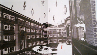
Both female artists present themselves as unique feminine individuals, courageousas they were, faced the challenges in their lives and stayed strong or at least pressed on and continued to live life. Both expressed their lives through the employment of symbols, to each their own styles, which is what I aim to do in my final piece. I wanted to express my thoughts on an idea or issue just as effectively as Frida and Lucia, yet at the same time provoke thought. I have images of myself in various perspective and positions so as to fit into the setting of the drawing and to bring out my intention and better express it. I also used some tactics such as replication (with reference to Rene Magritte) so as to make my work more expressive and dynamic. A picture speaks a thousand words, so here's my final piece!

Les Valeurs Personnelles (Personal Values), by Rene Magritte, 1952


Artist: Rene Magritte
Title: Personal Values (Les valeurs personnelles), 1952
Type: Oil painting
Dimensions: 80 cm x 100 cm

Magritte used a deadpan, illustrative technique that clearly articulated the content of his pictures. His painting style was akin to the Old Masters’ style, realistic and ultrafine. The illustrative quality of Magritte's pictures results in a powerful paradox: images that are beautiful in their clarity and simplicity, but which also provoke unsettling thoughts. They seem to declare that they hide no mystery, and yet they are also marvellously strange. Who would have expected to see objects with absurd and out of the norm proportions in a room? It is for certain that Magritte wanted to create a visual spectacular for viewers, who will upon being stunned by the queer images, start to question the definition of his painting.

“My painting is visible images which conceal nothing... they evoke mystery and indeed when one sees one of my pictures, one asks oneself this simple question 'What does that mean'? It does not mean anything, because mystery means nothing either, it is unknowable.”—Rene Magritte

Indeed, the objects portrayed in Personal Values are a mystery, but I disagree with mystery being unknowable as it can be solved. Firstly, there are several illustrations of mundane objects, namely the comb, bed and matchstick, wine glass, soap, armoire and the familiar sight of a bedroom. Combining the ensemble of ordinary items with the title of the art work, I deduce that these objects are perhaps the personal articles of the artist, symbolic of his personal values.

The comb is representational of a tool to present a socially accepted exterior. Its position—resting on the bed—mimics a standing figure; its placement reminds us of its relationship with the pillow. The comb is a tool used to groom one’s hair after resting, so as to present a kempt exterior to the polite society, an aspect of life that was perhaps most important to Magritte since he was a reputable artist and had to keep up a good image of himself in the public. The soap suggests the importance of grooming, which one again shows how Magritte was very particular about his personal hygiene and image.

The bed and the matchstick present a visual pun that suggests a play on the French phrase “Tu m’allumes,” or “You turn me on,” which conveys Magritte’s sense of humour.

The armoire suggests a psychological interior that holds clues to Magritte’s life. Also, the mirror on the armoire symbolizes psychological space and the realm of fantasy, a popular iconography used by the Surrealists.

The sky painted on the walls implies that this room is free from its physical limits as is human imagination, suggesting to viewers that it is up to their imagination to interpret the composition of Personal Values.

In addressing the process of creating Personal Values, Magritte wrote”Painting for me is a description of a thought. The thought can only consist of visible objects, which exist in my head as clear images…” And these vivid images translated to become the photorealistic images on the canvas that form his Personal Values.

My own Personal Values


Firstly, I would say that I don’t like to be in darkness, so I placed a lamp as one of the objects with ‘value’ to me. Only in light can I think properly and work at ease. Next, my spectacles are placed such that it faces the lamp which is suggesting that I am always seeking light (pun intended), be it the truth of matters or literally light that illuminates the world, but mainly, the value of the spectacles is for me to see.
Behind the lamp, there’s a pillow and an alarm clock—pillow simply because I need it to sleep and the alarm clock is needed for me to wake up. So by placing these two items together, I intend to create a sense of juxtaposition where the values of both items contradict, but they are actually placed together, on the bed. The alarm clock seems to be placed haphazardly because it is what I do every day when I hear the alarm—throw the alarm clock to one side—and continue to sleep.
In front of the lamp, there are three items, my watch, bus pass and notebook. The watch is for me to keep track of time, bus pass for me to travel to and from school and the notebook is for me to keep agendas. That’s pretty all, and the objects are in actual proportion because they are real and they have thereabout the same scale because they have equal importance to me—they are all my personal belongings and have equal status in my heart.

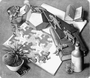
Reptiles, by Marius Cornelius Escher, 1943 (Lithograph)


Artist: MC Escher
Title: Reptiles, 1943
Type: Lithograph
Dimensions: 33.4 cm x 38.5 cm


I think I have never yet done any work with the aim of symbolizing a particular idea, but the fact that a symbol is sometimes discovered or remarked upon is valuable for me because it makes it easier to accept the inexplicable nature of my hobbies, which constantly preoccupy me.”—MC Escher
 
Lizards moving in a circular motion, definitely reminds me of a roundabout. What with the peculiar lizard puffing out fumes, this gang of reptiles certainly is a train in motion.
A train.

It could mean bullet train, traditional steam train or a train of thought.

A train of thought…

For a person who creates art with such fervour and rigour, who went through intricate planning for his tessellations, I would never read his art work at surface value. It may be just lizards tailing lizards, but perhaps it’s through this depiction of cyclical movement that brings out his notion for art.

He constantly sought for fresh inspiration for his art work, evidently in his trip to Italy in 1922, where he spent  all of the spring that year roaming the Italian countryside, drawing landscapes, plants, and even insects. Just like the lizards that are constantly moving, morphing from 3-dimensional to 2-dimensional, explorative and versatile as he was, the lizards mirror his attitude towards art.
Given his spontaneity, perhaps he had studied lizards in close detail before creating Reptiles and thus, he wanted to relate the animate lizards with the inanimate ones through Reptiles by portraying live lizards morphing into their own tessellation.

These interpretations all sum up to a single train of thought. From an idea or an impression that we make of this lithograph, we will start to imagine and draw analogies from our personal lives, what we observed with our five senses, as we try to interpret this art work. Then these imaginations will form thought, and from that single thought, many will follow as it multiplies and morphs. As you think deeper, you realise that it’s hard to trace back to the original raw form of thought. Just like the lizards moving in circles. You don’t know where the start of the cycle is and every time a lizard morphs into a tessellated form of itself, it will never be the same lizard that morphs back to life. Because it could just be any lizard in the vast infinity of its own tessellation; any thought in the vast infinity of our minds, that will continue to form the train and be a part of it.

A woman once rang me up and said, 'Mr. Escher, I am absolutely crazy about your work. In your print -Reptiles- you have given such a striking illustration of reincarnation.' I replied, 'Madam, if that's the way you see it, so be it.'—MC Escher

It’s a pity that we can only view his art work from a third-person’s perspective. But it is his ingenuity that inspires us all, that drives our thoughts to a different dimension, towards his way of thinking, his idea of art. He manoeuvres the train around his beautiful mind, one that sets everybody in awe.

We are but the passengers of this train, catching glimpses of his lattices of thoughts. And the driver is none other than MC Escher himself.


Reptiles is realistic and highly defined, albeit looking slightly grainy under closer examination, which could be due to the nature of the making of lithographs. There is rhythm, initiated by the motion of the lizards. The sense movement in the art work is not only indicated by the lizards, but also by the half-opened book on the top right corner. Its precarious position sets viewers wondering if the pages will fly. It also provokes thought since viewers may be curious about what the book is about, effectively spicing up the art work.
Amidst the monotonous tones of the art work, Escher was able to work up varying shades of grey to give depth and tone to both the 2-dimensional and 3-dimensional aspects of Reptiles. Not only that, the lizards and objects are also proportionate. This is a trait of Surrealism, which emphasises both realism in depiction of subject matter and the abstractness of the composition and subject matter. In reality, lizards can never transform into tessellated lizards and they will never look like crocodiles. Reptiles is a marriage between impossibility and reality, absurd happenings put in an ordinary setting, almost like a dream, but in this case, a nightmare. Monstrous creatures lurking in the midst of normality, mingling with ordinary objects, changing from on form to another and back again, which sets an eerie mood, giving an air of mystery, probing viewers to uncover its underlying meaning. It is indeed every bit a surreal image.
One reference I would like to make would be Swans. Swans depicts recurring images of well, swans, forming the infinity symbol, ‘8’ tilted 90 degrees, with the black and white swans tessellation as they intersect. This is similar to Reptiles as both involve a sense of movement ad rhythm like the way the lizards actually move around in circles and morphing into their tessellated form is reflected in Swans where swans also fly in circular motion and forming a tessellation. However, the tessellation in Swans actually differ slightly from that in Reptiles as the tessellation is created serendipitously when the black and white swans fly pass each other and in a particular angle that Escher captured, we are able to see a tessellation of black and white swans. The two flocks of swans, black and white, are flying in their designated directions forever, similar to the lizards, moving in circular motions forever, abiding by the law of time—infinity.  


Artist: MC Escher
Title: Swans, 1956
Type: Xylograph
Dimensions: 31.9 cm x 19.8 cm

An interesting animation of what Reptiles will be like in animation.